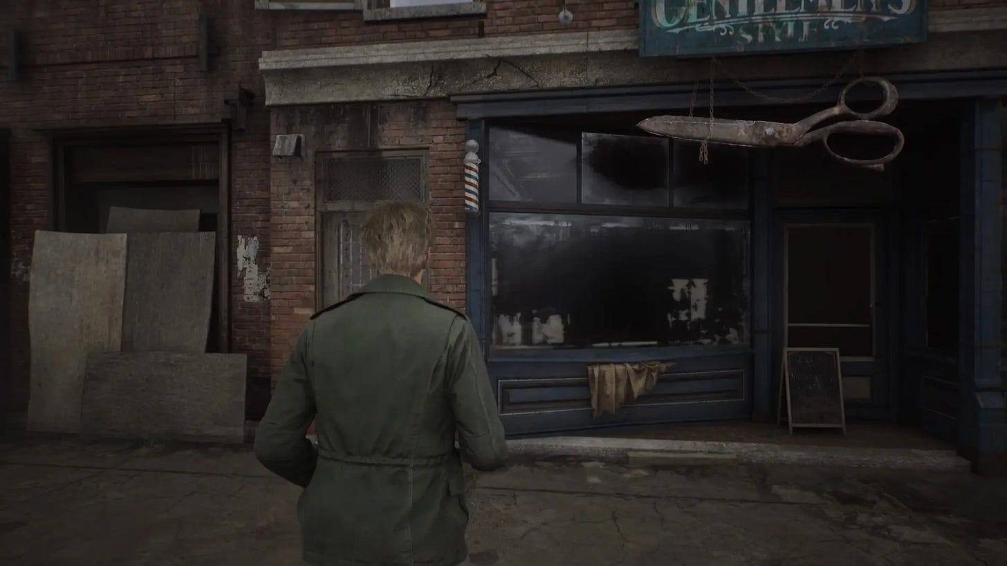
Silent Hill 2 Remake: A Game Designer's Perspective
I've discussed the impact of the opening and the main characters in previous installments. In this final part, I want to address the remaining issues, but in a way that might be more valuable to readers interested in game design. I'll identify each issue, then explain how I would handle it if I were the director of the Silent Hill 2 remake.
The point of this exercise is not to pressure Bloober into considering my proposed solutions or to step on the developers’ toes. I don't even know if any team member has seen these posts. The goal is to explain why something is an issue by showing the benefits of a different approach.
My approach might be clearer if I start with an example issue found in the opening minute of the game. This is how I would discuss things with the team...
1. Leaving Silent Hill
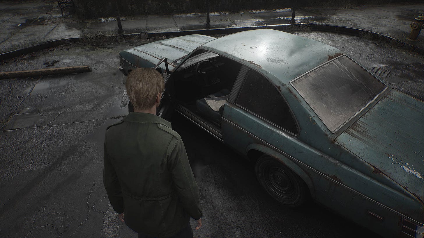
Problem: When the player turns around and tries to leave the first area of the game, going back to where they came from, they are turned around at a trigger line.
Why it's an issue: Many players test a game in the opening minutes. Before we're engaged with the gameplay and story, we experiment with controls, try to understand core mechanics, and test the game's limits. Going back is a common thing to do... Many games know this and even give you an achievement for it. Actually, Silent Hill 2 Remake does that, too.
The problem is, when the game just slaps you so hard with its invisible hand that you're doing a 180, it feels bad. It's like trying to enter a place that's not for you, and the bouncer says, "No. Now fuck off." That's not the feeling you want to offer the player. You want the bouncer to be nice. Reasonable.
This is especially important in the opening minutes when the player is building a mental model of the game and its world. This is when they decide what they think of the game's quality and vibe. So you want the opening segment to be spotless. The game grabbing you by the neck and turning you around just doesn't feel great.
Solution: Usually, there are three decent, working solutions to choose from:
In the intro cinematic, show the protagonist pass a blockade or jump down from a higher area, and only then give control to the player. Now they simply cannot go back, because the road is blocked or they cannot jump high enough to reach the higher level. Cool, but that wouldn't work for Silent Hill 2. The road is open; we just arrived in a car.
Get creative. In The Vanishing of Ethan Carter, the hero arrives through a long dark train tunnel. If the player turns around and goes back through the tunnel, they ...arrive back at the starting point. We simply turn the player around the right way midway through the tunnel, but we do it in a perfectly symmetrical spot, so they cannot tell they've been touched. To them, they just kept pressing forward but arrived back where they started. Creepy and weird. This could work for Silent Hill 2, as we know of many horror movies where the protagonist cannot leave a town they arrive at. It's a known trope. But with the wide open road, it'd take a lot of manpower, time, and money to do it right, and maybe the team should focus on more important things.
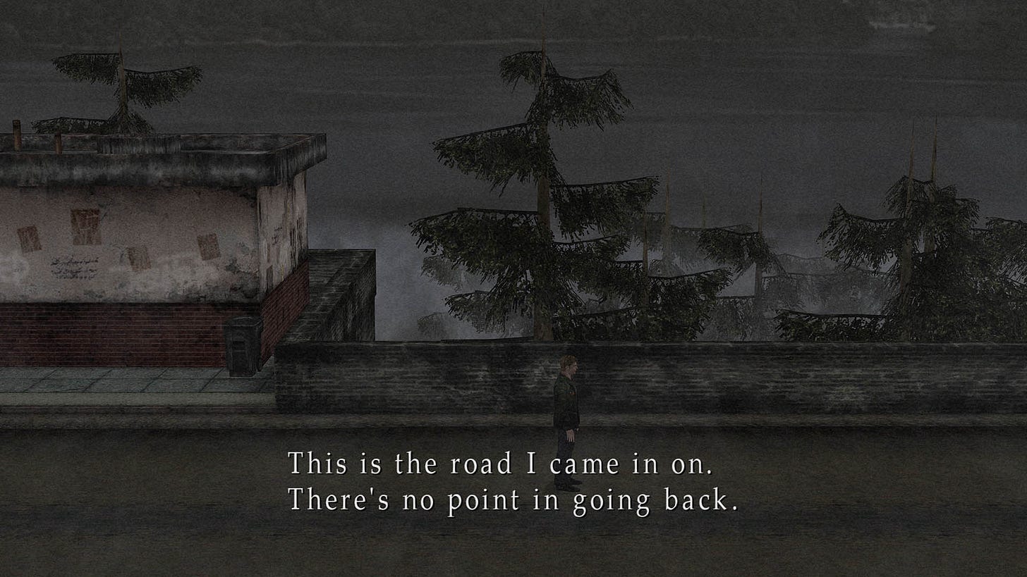
Have the hero acknowledge the player's action and politely -- the key word: politely -- decline. Preferably in a way that doesn't break immersion. This is what the original does:
It's not perfect. There's no voice-over, and you might ask yourself: who is he even talking to? It seems like he's talking to me, the player, which is weak and almost ruins the immersion. But what if we could do this without the downsides? Can we acknowledge the player's action, and decline politely in a way that feels right for the world?
Action item: Add a short cinematic showing James looking at the open road, then turning his head to look at the car, then looking at the road again. He sighs as if he'd love to leave but deep down knows it would be the wrong thing to do. He turns around, and we give control back to the player. If the player tries to exit again, display the same cinematic: it still makes sense the second time around and will discourage further trolling.
I hope this first example clarifies what I'm trying to achieve here: show how developers think about design.
Locate the issue. When something in your game feels wrong to you or the players, it's time to look at it.
Understand why it feels wrong. This is crucial and the most difficult part.
List solutions, discuss them with the team if you can (something I can't do here for obvious reasons).
Choose the best solution, turn it into an actual action item.
With this template in mind, let's look at other things I noted during my playthrough. Considering the size and scope of the game, I'm surprised there aren't that many, so hats off to the developers.
2. Watching Silent Hill
Problem: In the starting area, there are binoculars that players cannot interact with.
Why it's an issue: As I said earlier, in the opening minutes, players decide whether your game is good or not. This will affect their entire experience. They can and will change their mind if the game is better than its faulty opening segment, but good vibes are so much easier to achieve with that segment properly done.
Having a clear tease in the form of tourist binoculars pointed at a beautiful vista then not having any form of interaction with it is an immersion breaker and makes the player doubt you even care about the game or understand what you're doing.
Solution: This one is easy, and there's more than one good solution. Remove the binoculars. Partially destroy them so it's clear they're not functional anymore. Make it so the player actually can look through them at the town. Or have a short animation of James trying to look through them but saying that the fog is too thick.
Action item: I like the second one, with the partial destruction, or the last one. Both gel nicely with the theme of James currently not being able to see his issues.
3. Follow the white cloth
Problem: The interactive elements of the environment are often accompanied by a torn white cloth, to help the players along the way.
Why it's an issue: This is bad for two reasons. One, it's patronizing to the players. Everybody knows this is a gameplay feature, not a world feature. Two, anything that helps the players makes no sense in the world of Silent Hill 2. The entire game is about James refusing to acknowledge his sins. There is only one entity in the entire game that helps... no, forces him to face the truth, and that is Pyramid Head. James thinks Pyramid Head is a monster on a mission to kill him; that's how shielded he is from reality. To have the world be full of helping hands like the white cloth stands against everything the game is trying to say.
Side note: There is another entity helping James, a mysterious person leaving notes and items for him, but that's a whole different story on how universes interact, and the warnings that the person offers. Without going into details, this person has nothing to do with white clothes.
Solution: There are other ways to guide the player. Painting the hot spots red, using yellow tape or white cloth -- that's cheap and backwards.
To be clear, in my opinion, these things don't work even if they truly, deeply make sense for the world. Like, if you have graffiti left by a resistance movement around certain spots, that makes sense, right? To me, no. The players will always see through it; they know why you added this to the game. Just like movies changed and we no longer buy deus ex machina or clearly fake special effects that bothered no one in the 50s, we should just drop these artificial helpers.
Take a look at this video:
Is this how you want players to experience your game? See how she's not fooled? See how instead of being emotionally engaged in the exploration, she talks about how "they" (the developers) did this and that?
I get why the developers used the cloth. Some players truly need this help. And the symbolism of it fits the game thematically, even if it doesn’t quite make sense.
But there are a couple of better solutions to choose from here. One would be to remove the tutorial message about the white cloth and have the info about it sold to the player through diegetic means, e.g., a patient's note. Then, increase the amount of the pieces with the progress of the game, until it reaches grotesque numbers and culminates with some revelation of what the cloth truly is.
Another would be to remove the cloth and use light -- like all painters in the history of the world -- and maps and environmental storytelling to help the player in their journey.
Action item: Go back in time and kill the white cloth idea before it's implemented. If this turns out to be too difficult, double down on the white cloth but turn it into a story that develops rather than a marker that fools no one.
4. Make believe
Problem: Early in the game, a couple of events break the suspension of disbelief.
Why it's an issue: As soon as we put our foot inside Silent Hill, the game is hanging on a really thin thread. Imagine you go back to a town you visited years ago, and there's no one there except hellish monsters. You would certainly be questioning either reality or your sanity right away, right?
James doesn't do that. He does throw us a bone with "I guess I don't care if it's dangerous or not" when first meeting Angela, but that's not exactly solving the problem.
However, by the end of the game, when we understand what Silent Hill really is, it all makes sense. Throughout the entire journey, James' mind filters out the impossible ...because it's not impossible to him. After all, the world is his mind manifested.
But, as I said, the players don't know that until the end. So how do we make it all work, how do we make players reconcile the grotesque horrors of Silent Hill with an almost indifferent and unsurprised James?
You do two things. First, you make the world feel oneiric, hypnotic. And Team Silent did just that, with the weird sounds, the ever-present fog, and the long runs accompanied by haunting music. Second, contrast that with the mundane. Give the players some reality anchors.
You don't need to do that for long. An hour or even less into the game, you can start adding more and more weirdness. Five hours in, when James puts his hand into a toilet bowl full of crap or jumps into a giant dark hole, the player is already desensitized to actual reality and just rolls with James and the manifestations of his Jungian Shadow.
Until then, though, make sure that the game shares the player's doubts, and that weird shit doesn't happen out of the blue. You need to be really vigilant about things that players will question.
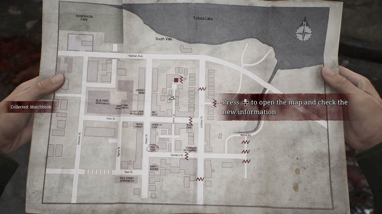
As an example, when James finds a matchbook near a corpse, he notices the name of the bar it came from ...and circles this location on the map.
But ...why? What is so special and significant about the matches that James treats it as a clue? Absolutely nothing. The event makes no sense.
It's not like that in the original, mind you. In the 2001 version, you find a note from someone saying they will be waiting at the bar. Considering the town seems empty, we can buy it that James holds on to the note and marks the place on the map.
Solution: Copy the idea featured in the original.
Action item: Add "I'll wait here" written on the matchbook. Review everything the player encounters during the first hour of the game and see if it's all logically sound — including dialogue and monologue.
5. Bodychecking doors
Problem: Players do not open doors like normal human beings. They try to open them by running into them.
Why it's an issue: For a game that wants to be an immersion sim, fighting doors is just plain silly. It's one of the most questionable design decisions in the remake.
Now, I don't want to second guess the developers here, but I'm quite sure they started with the regular old school door opening just like in the original. After all, it is simply how you interact with any other object in the game. But somehow they landed on bodychecking the doors and everyone involved agreed it's better. I wonder what the reason was, but nothing springs to mind, at least nothing that isn't easily solvable anyway.
Solution: The original wasn't perfect by any means in that regard but had some good pointers.
Action item: Divide doors into two categories: openable and not. Make it visually clear which is which, for example, remove the handles from unopenable doors, board them up, put black goo over the lock, etc. Have opening doors consistent with how the players interact with any other element of the environment.
6. The lack of super easy difficulty
Problem: The lack of a super easy difficulty setting.
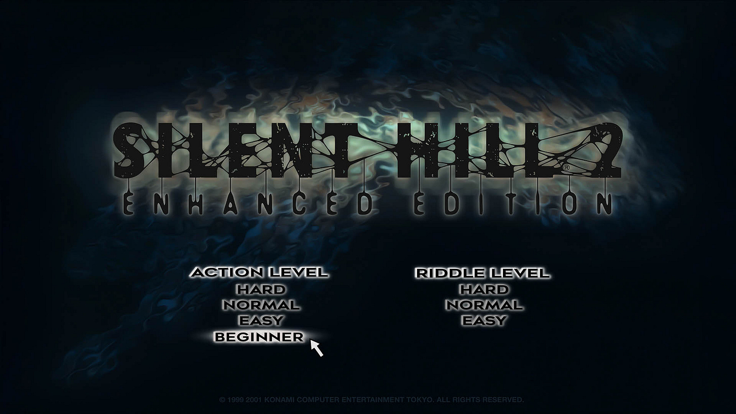
Why it's an issue: The original had four difficulty modes for the action layer. One of these was Beginner difficulty, which made the game very easy. This was perfect for people who were only interested in the adventure side of the game: the puzzles and the story.
I would even argue that a godmode-like Action difficulty would work, too. SOMA is a horror game that added such an option, and the world still stands. I made a hardcore FPS called Painkiller, and we added a super easy mode that trimmed any enemy damage down to just 1 HP. It was basically a godmode. Nothing bad happened. There is no point in gatekeeping difficulty in games that have difficulty options.
Meanwhile, the lowest difficulty in the remake feels like at least Normal in the original. I was quite shocked to see that it takes three full swings to down the very first enemy, and that just one slap makes my health go into the red flash zone. As a test, I used external software to increase my damage to 300% of the nominal value, and only then did the easiest difficulty in the remake start to resemble the easiest difficulty in the original.
Solution: It's not Dark Souls. Let people tailor their experience more. Don't be afraid they'll finish the game too quickly; most people choosing the easiest difficulty play the game the longest.
Action item: Add Beginner difficulty resembling the original, or add a godmode-like difficulty where dying is almost impossible, or add both. If time allows, reduce the amount of trash mobs on these difficulties.
7. Pyramid Head is no longer scary
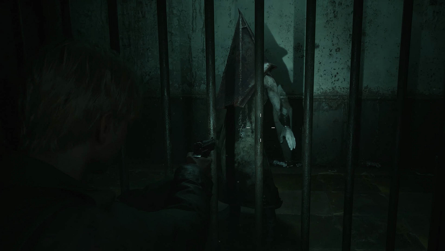
Problem: One of the most iconic characters in the history of video games doesn't invoke fear anymore. Instead of a monstrous executioner, he now looks like a malnourished puny dude with a small bathtub on his head. Also, the first scene in which we meet him is more funny than scary. See for yourself.
Compare this to the original.
Here, James stumbles upon Pyramid Head and quickly and quietly hides in the closet. When the monster approaches him, James panics but fires at his body. In the remake, James awkwardly and loudly hides in the closet. When the monster approaches him, James semi-calmly fires at the only part of the monster that is covered in an two inch-thick iron. Oh boy.
Why it's an issue: Come on.
Solution: Make Pyramid Head great again.
All right, let's get serious. The problem with Pyramid Head is that he is more or less the same in both the original and the remake. But while he works perfectly in the original, he doesn't in the remake. Why? Didn't I just say both versions were the same?
Well, in the original, the shape and size of Pyramid Head is distorted by the camera angles, strong noise, low poly count, and low resolution. Basically, he leaves a lot to the imagination.
In the remake, the hi-fi visuals expose the true Pyramid Head, and as it turns out, he's not that scary.
What the developers should have done was to copy the vibe of the monster, but not the monster. Let me explain using an idiom example. In Polish, when we want to say that something is easy, we say it is a "bułka z masłem". This literally means "a buttered bun". Which is confusing. But if I said it means "piece of cake", then suddenly you get what I'm saying.
And so it goes with Pyramid Head. For the remake, he should not have been "translated" literally, as this makes him lose his appeal and power. He should have been treated like an idiom that requires its own new thing for the remake.
Action item: Make Pyramid Head slightly taller, as with the camera that the remake uses, he looks smaller. This is a well-known side effect of TPP and FPS games with the player-controlled camera. So even though in theory he should be James’ height, as he’s based on him, we need to compensate for the perspective.
Also, increase his muscle and fat mass to make him more intimidating, like in the original. Or like in the remake’s very own key art…
…where he is not as malnourished and puny — on the contrary, he exudes power and intimidation.
8. Painful exploration
Problem: A marker showing that this or that element of the environment is interactable appears only when close to the element.
Why it's an issue: Wall hugging feels necessary for exploration, and it shouldn't be.
Solution: Here is the problem that Bloober faced: in the original, there were no markers. You had to guess which item or object you could interact with. That worked in 2001 because the graphics were simple and it was quite easy to understand which elements of the environment were important. With much more detailed and rich visuals in the remake, this is no longer the case, and so a much more modern solution was chosen: interactivity markers.
I think it was the right choice, and also you can turn it all off and go old school if you want. But the problem is that the markers appear only when very close to the object. Look how close I am to the map in the car, and the marker still did not appear. I would need another step forward for that to happen.
As a result, players feel like they need to hug every wall and every corner in order to make sure they did not miss anything.
Action item: All that is needed is an increase in the range of the interactivity markers.
9. Banal monster sounds
Problem: Monster sounds are forgettable, run-of-the-mill shrieks.
Why it's an issue: These are well-done, high-quality sound effects. But we've heard similar shrieks and growls thousands of times. There is nothing idiosyncratic about them, unlike the original that offered unforgettable, unique, "there's nothing like it" kind of sounds.
The banality of these sounds makes some sections of the game feel like a generic horror rather than Silent Hill 2. The eerie, unsettling atmosphere of the original is replaced with stock jump scare vibes. Just compare the sound of Creepers in both games.
Solution: Designing unique, intriguing sounds is a challenge. Doing that for monsters is even harder. I would basically ask Mr. Yamaoka for tips and tricks and a guide on how he went about creating the sounds for the game. Maybe there is a single, simple key that would open the door to greatness.
Action item: There is no easy and fast solution here ...except the game features a surprisingly low number of enemy types. It should not be too hard to focus on the select few that appear most often.
10. Stamina
Problem: The protagonist runs out of breath only sound-wise.
Why it's an issue: In the original, Stamina played a big role for both combat and immersion. Personally, I think it was overdone and it felt weird to start moving slowly only after running for a few seconds. So while I think it makes sense that this was removed in the remake, I'd love to see James get tired both visually and sonically. It would certainly add to the believability, and that in return helps immersion.
Solution: James already breathes heavily for a while after a lot of running. All that is needed are some extra animations.
Action item: Add a short, interruptible animation (plus variants) of James catching his breath after running for X seconds.
This is it, these are the top ten issues in my opinion. Some are big, some are tiny, but they're all something that bothered me personally. There are a couple more things I made some notes about, but nothing that I care that much about. Let me list these things here quickly, without the template I used for the top ten.
Not a fan of the TVs everywhere. I get the symbolism, but it starts to feel like Alan Wake rather than Silent Hill.
When I don't have a map of an area, the game should let me know that when I press the map button. Currently, nothing happens, and that feels like a bug. It was done right in the original.
That map is not still when I look at it. There is a suggestion in the game that James is an alcoholic, but that's not it. It feels like the map is moving around just so things do not feel artificial -- after all, no human would be able to keep it perfectly still. Cool, but the effect is overdone.
Sometimes Maria looks at James during gameplay, sometimes she doesn't and just stares into nothing. She should always look at James when free running.
I love Night Mode for sound in games. But the one in the remake just doesn't work or isn't set properly.
Since the prison, the pacing is all wrong. Until the end of the game, it feels like hours and hours of running through corridors.
Where is my grain? Either it's not there or it's too light. I know a lot of gamers hate grain, but when done right, it's a fantastic tool that makes the image feel more natural and less clinical and sterile. Witchfire has grain but no one complains because a) it's tweaked to have the effect but not be annoying, b) there's an option to turn it off.
Silent Hill is in Maine, but here it feels more like Copenhagen in Denmark. Same issue as with Alan Wake 2. This is supposed to be America, but it feels like Europe. Meanwhile, Team Silent delivered something that feels right despite making a game in a Tokyo skyscraper. I think that the reason is that the original game used a warmer, slightly more reddish palette. We associate this with movies, and most movies we watched in life came from the USA.
It's kind of crazy that I had to use an external hack in order to unlock the framerate during cinematics, and that the built-in framerate limiter only offers 30, 60 and unlimited to choose from. It's 2024, unlocked fps and fully customizable framerate are a standard.
Just so we end up on a nice round twenty, the final issue is that while I know the game is not an open-world extravaganza where any path is legit and possible, there are places where things are a bit silly.
There you go, twenty issues. I hope it's been fun to see the way a designer looks at a game. And so now for my final thoughts on the remake...
Here's a quick summary of pluses and minuses. Let's start with the goodies.
State of the art visuals and audio. A benchmark. The environmental assets are some of the best I have ever seen, and the locations are skillfully crafted.
Generally high production values. This is clearly an AAA production, achieved by Bloober with a team much smaller than you would expect.
In my playthrough, I have not experienced a single glitch or crash and the few bugs I've encountered were nothing worth mentioning here. Fantastic job.
Top-notch acting and voice acting.
You can feel the developers' love for the game. Literally dozens and dozens of secrets and easter eggs.
The puzzles are much, much better than in the original.
And now for things I wasn’t a fan of.
The journeys of certain key characters, including the protagonist, are flatter.
The symbolic layer is not as coherent as in the original.
While technically amazing, audio is not as otherworldly unique as in the original.
The optimization could have been better. I had to turn off some sexy options and turn on the DLSS to keep 100+ in 4K in what is a linear adventure game with a severely limited amount of enemies on the screen at the same time.
Silent Hill 2 was lightning in a bottle that happened because they didn't know they couldn't:
There was a feeling among the development team that we were going to challenge ourselves to make something never before seen in videogames. The team happened to contain a lot of members who approached things in ways you wouldn't expect from game developers, including the kind of movies and novels they'd experienced, Crime and Punishment included. We all loved works that you could consider literary, as you put it, or minor. When all of that energy was added and multiplied together, though, it turned into something major, resulting in the work it became.
— Akira Yamaoka
To see it alive and well two decades later, during the renaissance of survival horror, feels like a blessing.
Which version do I prefer personally? To be honest, I think the original Silent Hill 2 is a better experience...
...but the remake is a better game.
In other words, if you are interested in a masterful handling of a story, symbolism, and immersion, I would recommend the original Silent Hill 2 over the remake, especially with the fan-made Enhanced Edition mod that makes the visuals bearable and fixes a lot of issues.
But if this is not a priority, and you value gameplay, puzzles, visuals or survival horror vibes more, then the remake is the right choice.
Or, be like me, and consume it all. Finish the original first, then play the remake. This is the way.
Whether I have issues with the remake or not is irrelevant to the fact that gamers love it, and it sells well. Like Baron Münchhausen, Bloober managed to grab their own neck and pull themselves out of the AA limbo into the big leagues. I love almost all their projects since the first Layers of Fear (a reminder that Observer is one of the most underrated games ever), and their growth is exciting.
Here's hoping that we get Born from a Wish one day, and all that's left to say for now is the meme below. Thanks for reading!
…and Born from a Wish, of course.
P.S. Let’s not forget Born from a Wish.


