Silent Hill 2 Remake: A Critique of the First 60 Seconds
If Silent Hill 2 was Mary, then Silent Hill 2 Remake is Maria. Born from a Wish for modernized visuals, it's sexy and intriguing... but "you're not Mary".
It pains me to write these words for two reasons.
One, I'm the guy who always cringes when I open IMDB and read user reviews stating "the original is better". This is often not true. For example, The Thing, The Fly, or The Crazies are remakes vastly superior to the original movies. But today, I am someone who writes exactly that, "the original is better". Oh, the irony.
Two, the Silent Hill 2 Remake was incredibly close to getting it right. It's frustrating how close it was. With some effort, the game could be fixed in a month or two. No one is going to do it, of course. I'm just saying it to emphasize how close it was to being the definitive version.
It's still a worthy purchase, to be clear. If you can afford it, buy it for the full price. So many great survival horrors await their reincarnation, including other parts of the Silent Hill franchise. And Silent Hill 2 Remake is worth playing for the new puzzles and flow alone, but you also get mind-blowing audio-visuals and -- I know this sounds weird but hear me out -- the opportunity to learn a lot about storytelling.
In my first essay -- yes, there will be more -- about the remake, I want to show how the first sixty seconds of the game differ from the original and why it's a problem bigger than one might think.
Silent Hill 2: More Than Just a Game
To understand the impact of the changes, we need to establish one crucial thing. Silent Hill 2 is not like other games.
I know you know. This is why you're reading this, after all. We all feel it, we all know it: Silent Hill 2 is a masterpiece. Not only a game that so many people enjoyed but also an incredibly influential one.
But why?
I think it's because in addition to the great visuals (at the time, of course) and music and sounds and story and twists and turns and tons of other things, it's one of the few games that invested so much in symbolism and thematic design discipline.
The interesting thing about symbolism is that the viewer (movies), reader (books) or player (games) does not need to understand it to feel its power. In The Godfather movie, oranges foreshadow a tragedy. Most people would never catch on it and halfway through the movie scream "Oh my God, an orange, someone is going to die!". But the subconscious gets it, and we become more engaged and aware whenever they're present.
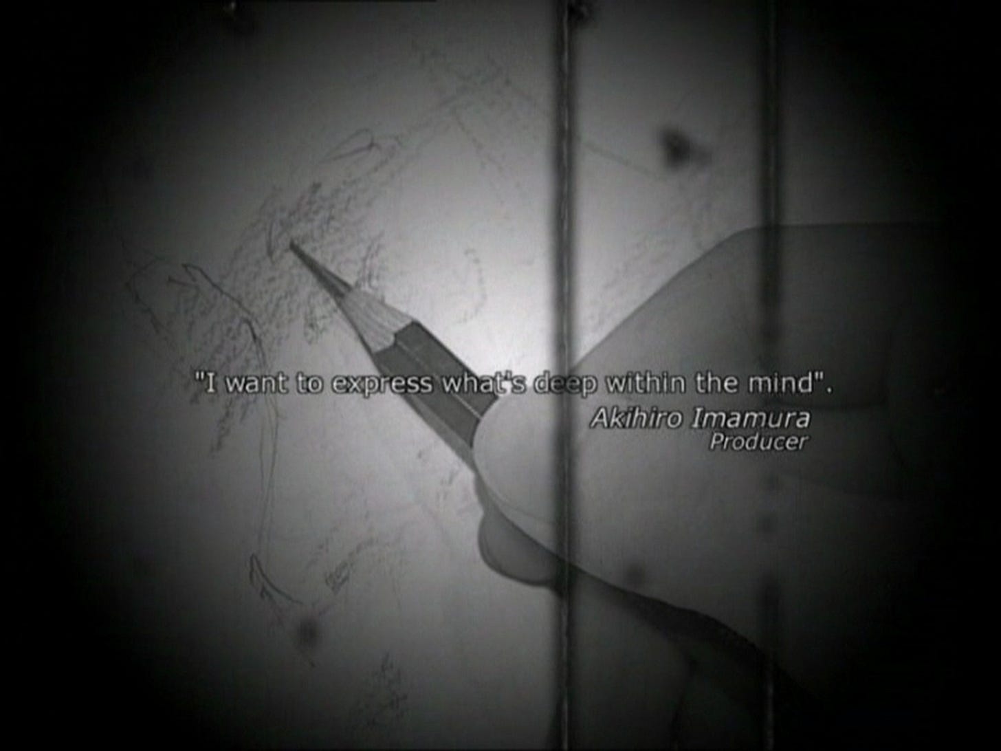
As for the thematic design discipline, nearly everything that exists in the game was deeply thought through. I'm sure some things are accidental, that's just how it is when you make a video game, but most of it exists for a reason. Just take a look at these two quotes from the Making Of DVD, released only in Europe:
And this one is from Hiroyuki Owaku, the programmer and script writer:
I want the consumer to not look at Silent Hill 2 on the surface... Rather I want them to look a little deeper... It's easy to say that this is a story with certain facts. I want the player to question "Why did the creators do this or that? Or why did James or Maria react this way?.." This is a game where the questioning needs to be deeper to appreciate the real underlying story.
Whenever I watch any documentary on Silent Hill games, or read interviews or even tweets from Team Silent members, it's clear the creators were impressively purposeful in the design. They had a story to tell, and nearly everything that exists in the game was made with one goal only: to make it ring true.
And this is why the game resonates with us, over two decades after the release.
So if you change anything, you'd better have a damn good reason. Structurally, Silent Hill 2 is almost a perfect game, with all of its elements having a purpose. You don't mess with that unless you can make things even better.
Now, let's take a deep dive into the first sixty seconds of the game. Here are the most important elements of the intro cut-scene in the original…
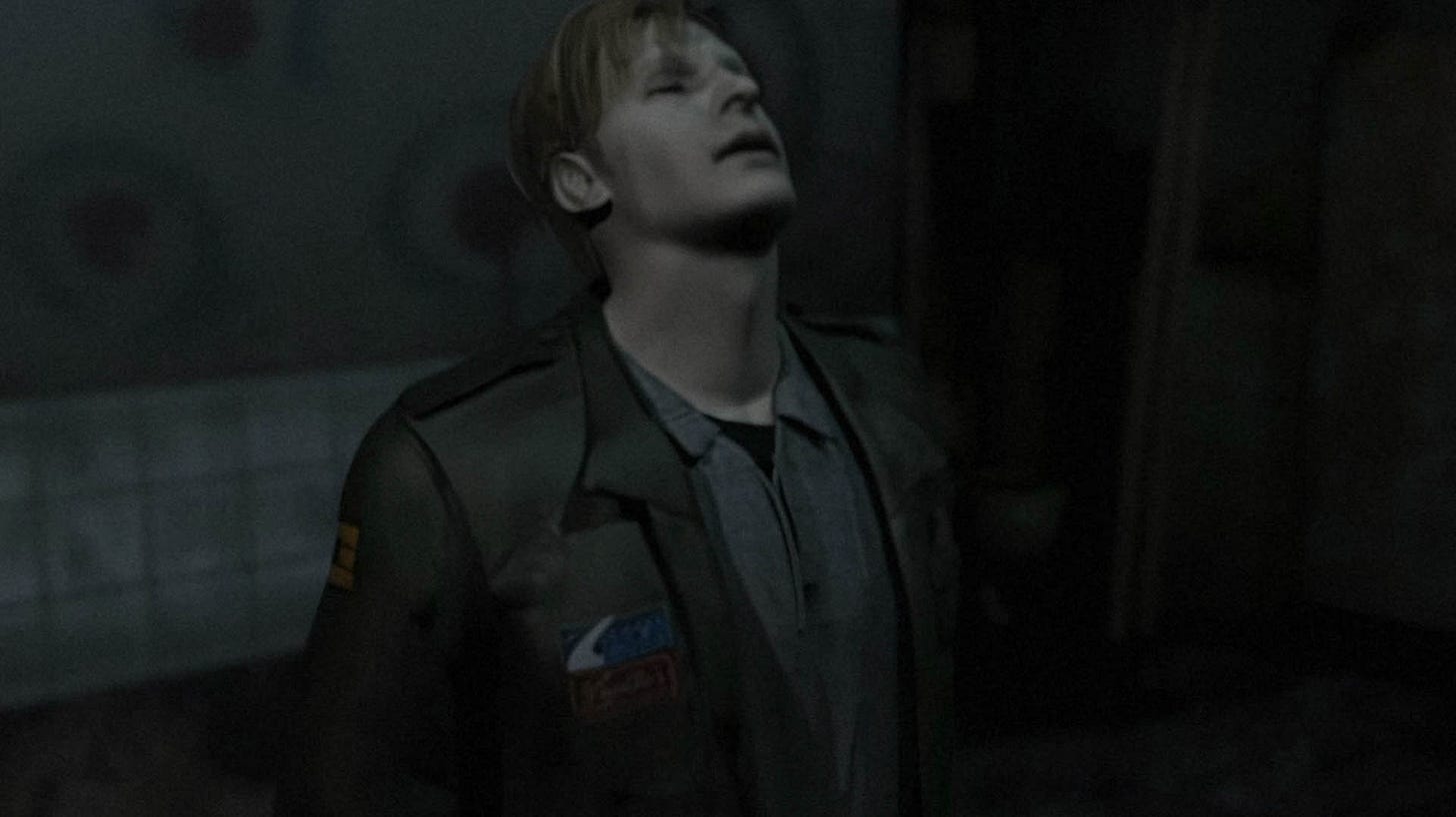
A mysterious man stares into a mirror. We cannot see his eyes. This is the same trick that Coppola used in The Godfather (1972). Eyes are windows to the soul, and these windows are closed. We cannot say if the man is good or evil.
We don't know it yet, but we now witness the duality of James. There's his true face, true self, and the fake persona he invented, one who is not a murderer. Note that we only see the latter, the reflection in the mirror: it is him but it's also not.
The man does a weird gesture. This is not bad motion capture or anything; on the Making Of DVD, you can see the artist doing the exact same gesture for the camera. It's a bit surreal, but if it resembles anything concrete, it's like an act of putting on a virtual mask over his face, creating a shield. We know why he does it. He is going to wear that mask for quite a while.
The game now shows the man to us. It's okay, he is safe from our suspicion, shielded, wearing the mask. We are tricked into thinking this is just a guy. Possibly resting after a long trip or something. A nice man, nothing more.
But then we see he is inside an absolutely horrendous restroom. Note how the color tint has changed to infernal red. The restroom symbolizes his internal struggle. His mind is corrupted by the lie, and the lie is his personal hell. He may be wearing the mask, but the environment betrays him.
Of course, the players do not know that yet. What they subconsciously notice, though, is that the man does not seem bothered by the restroom. They will associate this James with rot, but that will only make sense to them a dozen hours later.
And now, the player is in control. It's nice because you can learn the basic controls in a small confined area. Also, giving the player control this quickly lets the mind rest from all the symbolism and messages the odd opening has conveyed.
But ...in reality, the player is still being fed the hidden truths. There is a door on one of the walls. But this is not the exit; this is literally just a door someone ripped out of the frame somewhere else. It takes a moment to understand that. This is where the player subconsciously learns that things are not what they seem.
Leaving the doorless restroom shows us a healthy, refreshed James just taking in the nice atmosphere. He's just chilling now, recalling the letter from Mary. We are ready to begin our adventure.
In the player's mind, we're a cool dude who got a mysterious letter from his dead wife and arrived at this place to look for answers. We wish him the best, that his wife is somehow alive. The other James -- the shed skin of the outside James -- was left behind in the restroom. Our adventure begins.
Now let's see how the remake does it and where I disagree with it.
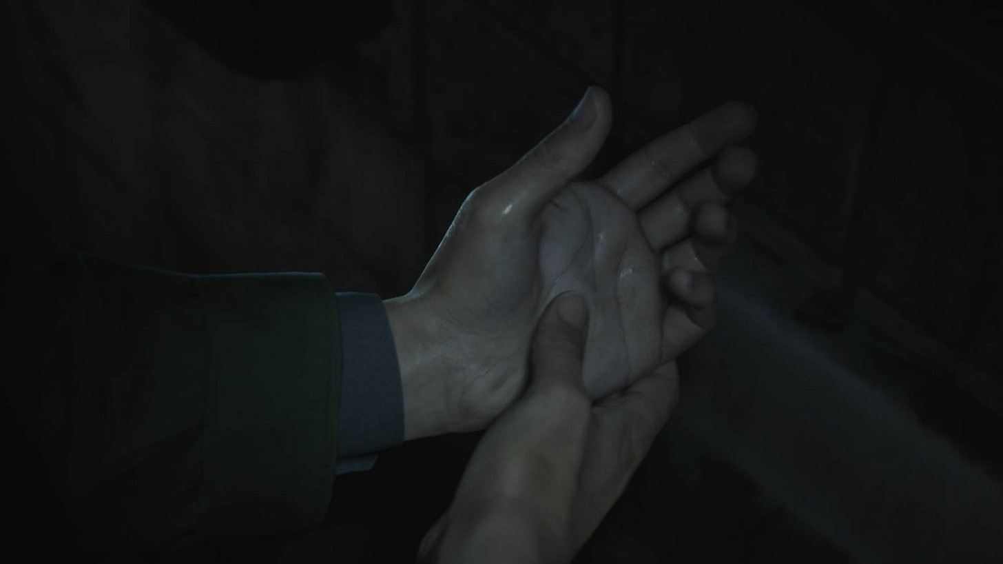
We start with shaking hands. A man is trying to regain control over his body; he is clearly upset.
He touches his face to check if he's fine or real at all.
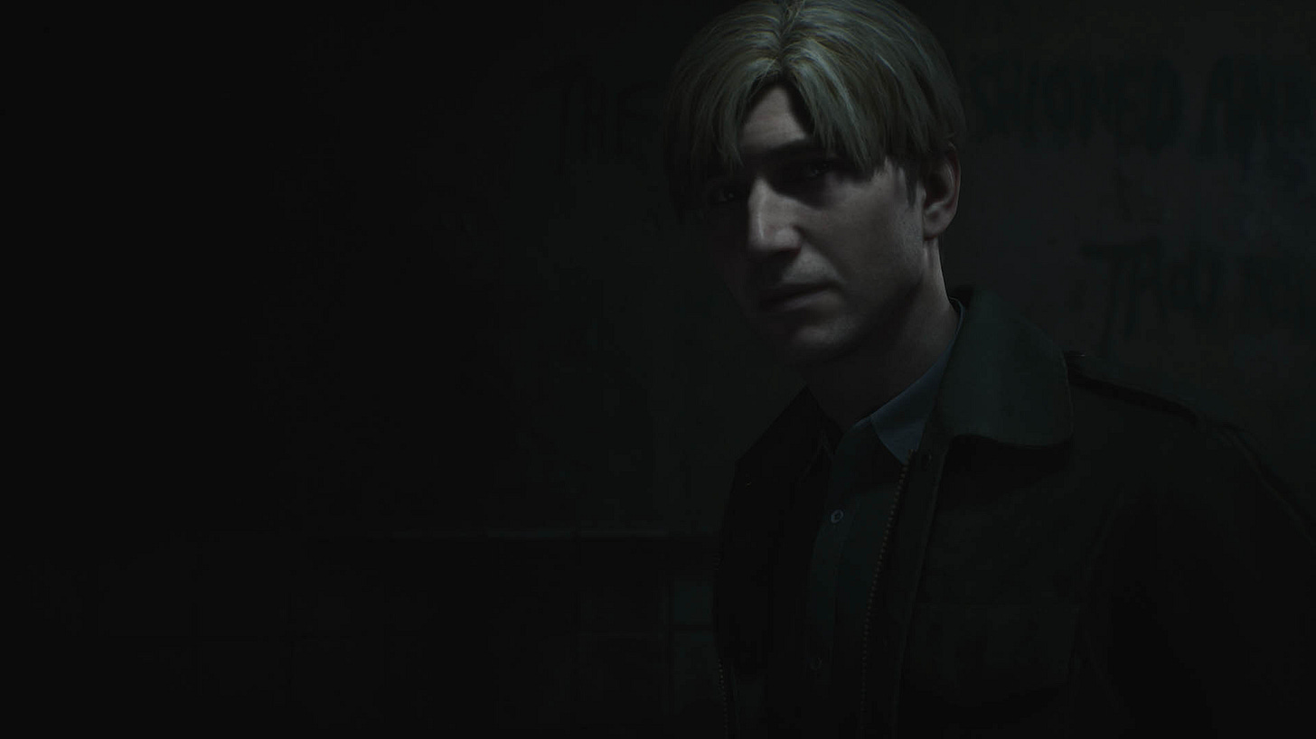
He leaves the dark restroom, taking one last look in the mirror, eyes full of pain and regret.
He opens the door and we go outside, admiring the next-gen visuals. James walks towards the edge as if he's catatonic. He rests upon the railing, lost in his thoughts.
That's it, that's the scene.
There's no gameplay break to distinguish between the "death" of old Murderer James in the bathroom and the "birth" of the Cool Guy James on the outside. There's no symbolism either. Nothing. Almost everything is literal.
I say "almost" because one could argue that James leaves the darkness (the restroom, which, unlike in the original, is just a dark dump) for the light. But even that tiny trace of symbolism is undermined by James clearly behaving like a guilty person: shaking hands, the painful stare, the catatonic walk. We no longer have a nice dude on a mission to solve the mystery of his wife. We have a broken man who just did something bad and looks like he just wants to off himself.
Watch that cut-scene again, please. Does this look like a nice guy who just created a fake persona for himself to disassociate his mind from the murder he just committed, or does he simply look like a person feeling guilty?
On the surface level, it's two similar scenes. A man stares into the mirror then leaves the restroom. But the details are all different, and so are the vibe and the message. The original is a masterpiece of planting symbols and themes inside the viewer's head; the remake is a visually stunning fact sheet.
The Why Behind the Changes
Now, why was the game changed this way? What was the reason?
Here is my theory. In a now-deleted tweet, Konami once said the game was remade for "modern audiences". Judging by some other elements of the game, it's clear to me that the publisher wanted the edge slightly blunted.
Been there, done that. When I was making Come Midnight, we made a scene where the hero emerges from an old house holding a child he just saved. This being a 1940s game, the man was also smoking a cigarette. And the child coughed because of the smoke. I thought it was hilarious because it's exactly what happened in the movies of the era, where you could literally see surgeons smoking during open heart operations, and yet today we know better. But the publisher said absolutely fucking not, no, you cannot have a cigarette and a child in the same frame.
With reports of publishers requesting changes to even the most innocent of games, it's very likely the changes to the opening were demanded by Konami (the publisher) and there was nothing Bloober (the developer) could do about it. I do not know for sure. I could ask, obviously I know a lot of Bloober developers, but I don't want to put them in this position. So it is speculation, but I can easily imagine Konami not wanting to start a game in a dirty toilet stinking of piss and shit, and explaining to the developer that "once we got them hooked, you can descend into madness and grit, but for the opening, keep it nice and clean". Hence only a moment in the restroom, hence its darkness.
But again, I do not know for sure, and even with the publisher's interference, the opening should have been better. So for now and for the future, I am going to write these analyses regardless of the reason for all these changes.
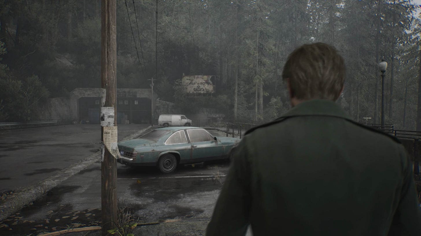
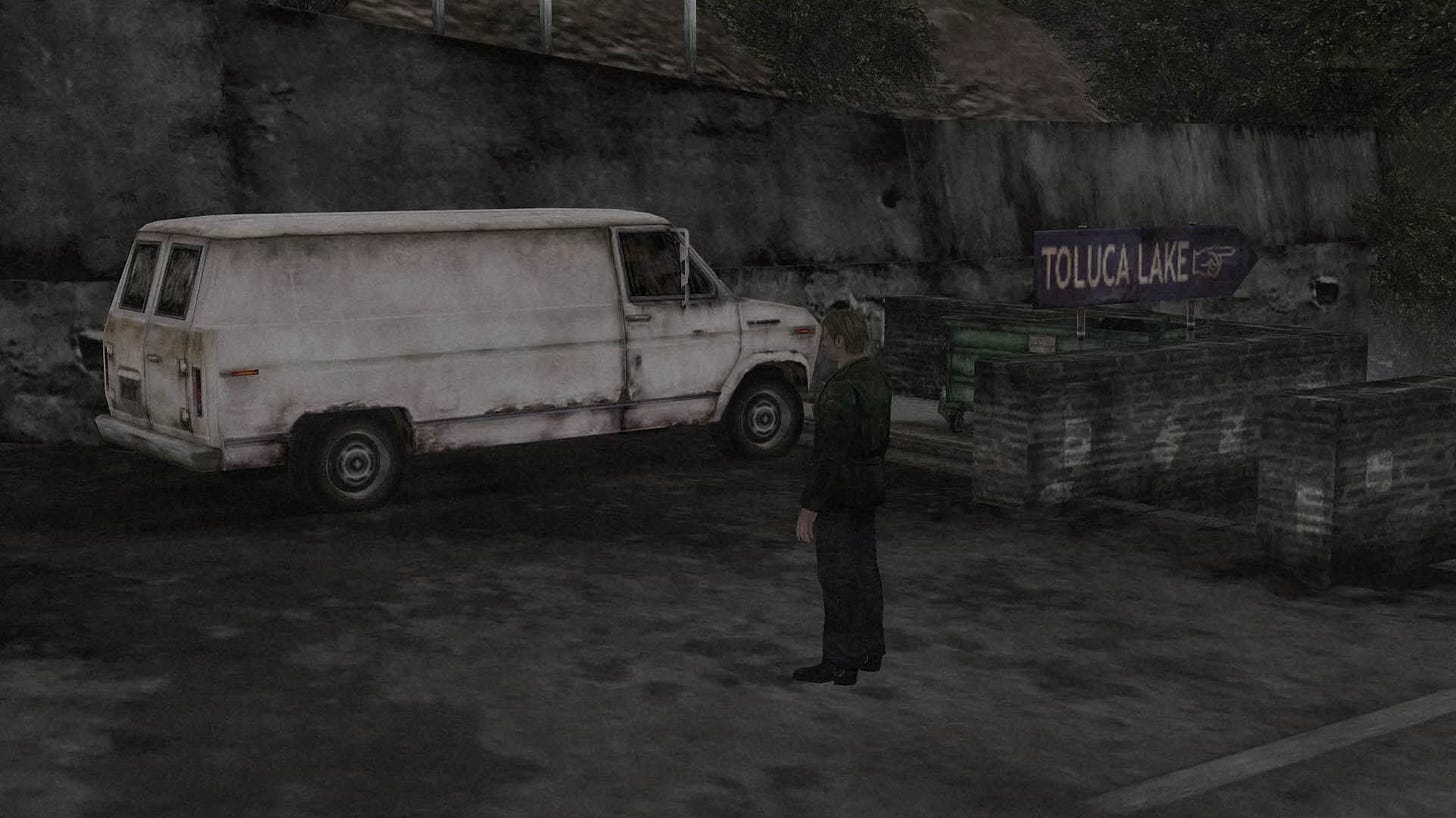
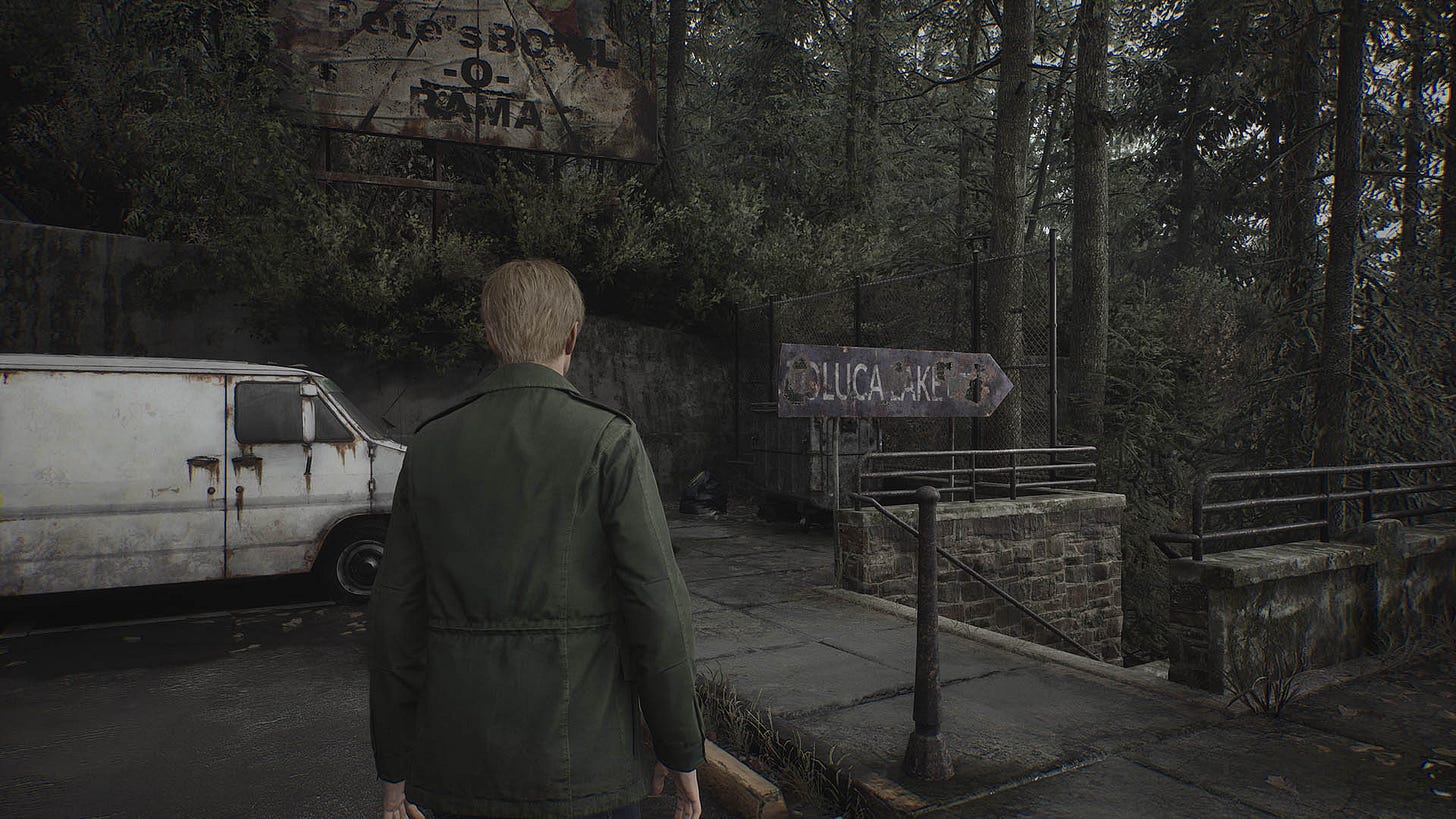
Let's go back to the opening segment. Compare these images from the original with the images from the remake. What do you notice that is different?
In the original, the lake sign is nice and clean, and the Welcome sign is not accompanied by any negative messages. In the remake, the lake sign is rusty and broken, and there is a Stop word written in giant letters on the ground.
It's almost like a way to describe the difference between the two openings. In the original, a dark man transformed into a Nice Guy James, and the world of that person is relatively clean and positive for now. In the remake, a dark man remains a dark man the entire time and his world is slightly oppressive and corrupted.
This means there is a much bigger dynamic range in the original because we go on a journey from Nice Guy James to holy fuck I murdered my wife. In the remake, we already start as Dark Broken James, and that removes an entire octave.
Believe it or not, there is one more thing that affects the player's vibe in the opening area, but I'm going to leave it for one of the next installments of this series. No, it’s not this…
For now, try comparing what happens in the original versus the remake when you try to leave the area the way you arrived.
Is It Really Such a Big Deal?
One final question for today is: okay, but is it all really such a big deal?
To me, yes. Not because I want the original untouched, and any alteration is a heresy. Nah, that's not it. The Remake is a Remake, not a Remaster. It’s fine to change things. But when you turn the complex melody of the opening, clearly a thoughtfully crafted scene, into a flat one-note song, then I cry.
But the thing is, even if it's not such a big deal I make it out to be, there is a process in psychology called death by a thousand cuts. Wikipedia defines it as "the way a major negative change which happens slowly in many unnoticed increments is not perceived as objectionable".
And there are quite a few of these cuts in the remake. Not a thousand, but enough to make an impression.
Each small change, like the altered opening sequence, the rusty lake sign, or the added "Stop" message, contributes to a subtly different atmosphere and narrative experience. While any one of these changes might seem insignificant on its own, their cumulative effect can and does substantially alter the game's impact and the player's journey.
But there are fantastic things, too, exceeding the original.
More about it soon.
Part 2:


